SUMMARY
I developed an illustration style guide to serve as a road map for visual content creation across eero’s brand touchpoints. We landed on a style that feels unique to eero’s brand, yet remains flexible enough to scale across and device.
DATE
2021
ROLE
DESIGN LEAD
ART DIRECTION • ILLUSTRATION
CONTRUBITION
Areas of focus
GOALS
Complete a style guide with the necessary tools to build and stage illustrative vignettes with characters, props, and environments whether working with existing assets or creating them from scratch.
Build a foundational library of grids, proportional guides, and color palettes.
PROBLEM AREAS
Current illustrations were created on a one-off basis, and were not scalable for other illustrators to build from.
Approach
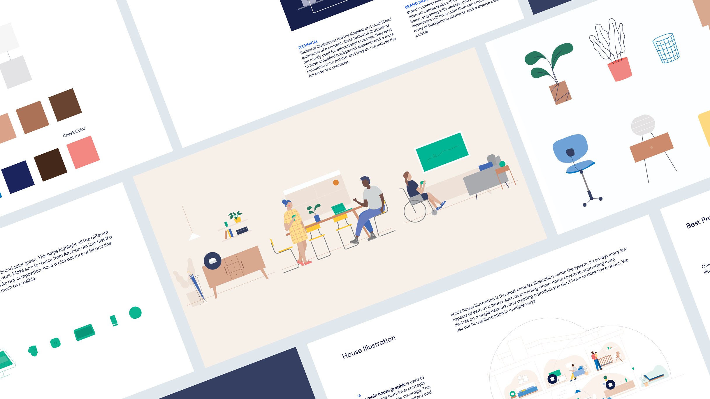
Influenced by eero’s name sake, the illustrative style approach is expressive, organic, and clean with influence from mid-century modern designs.


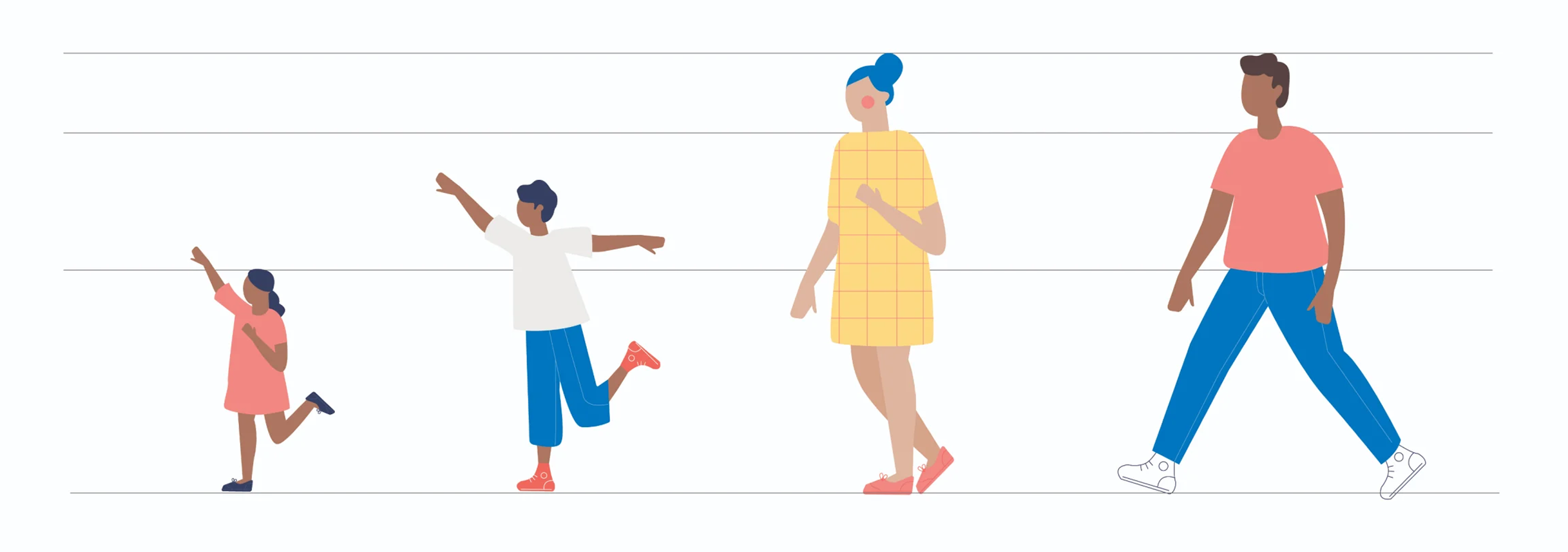
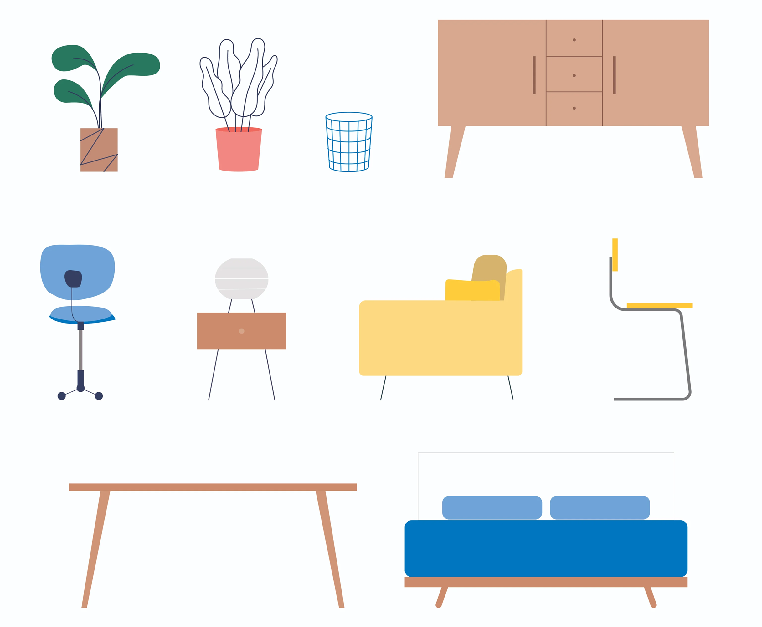
Characters and objects
Building scene objects on a grid system involves starting with basic geometry, then introducing organic curves, then finalizing with stroke detail.
Devices
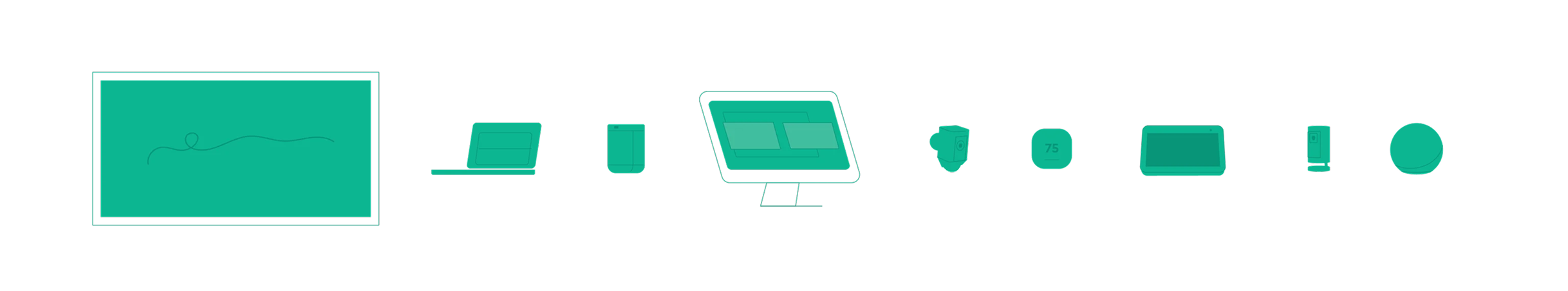
All electronic devices were the eero’s brand color green. This helps highlight all the different devices working under an eero network.
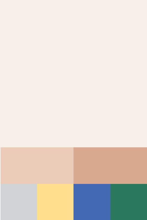
Color schemes
I curated three color schemes designed to be interchangeable in schemes to convey a variety of mood and tones.
Background color
Background elements
Foreground elements