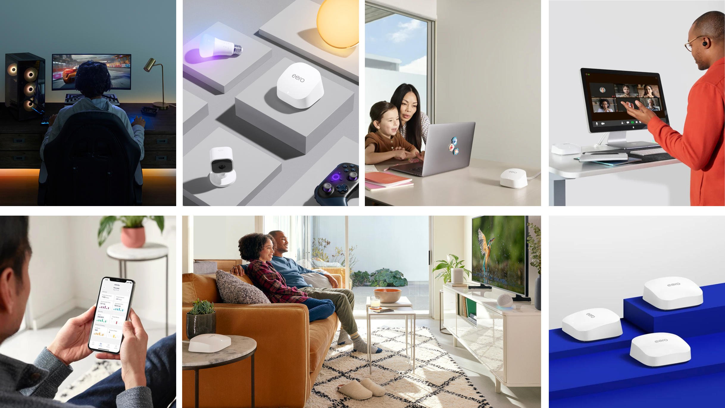
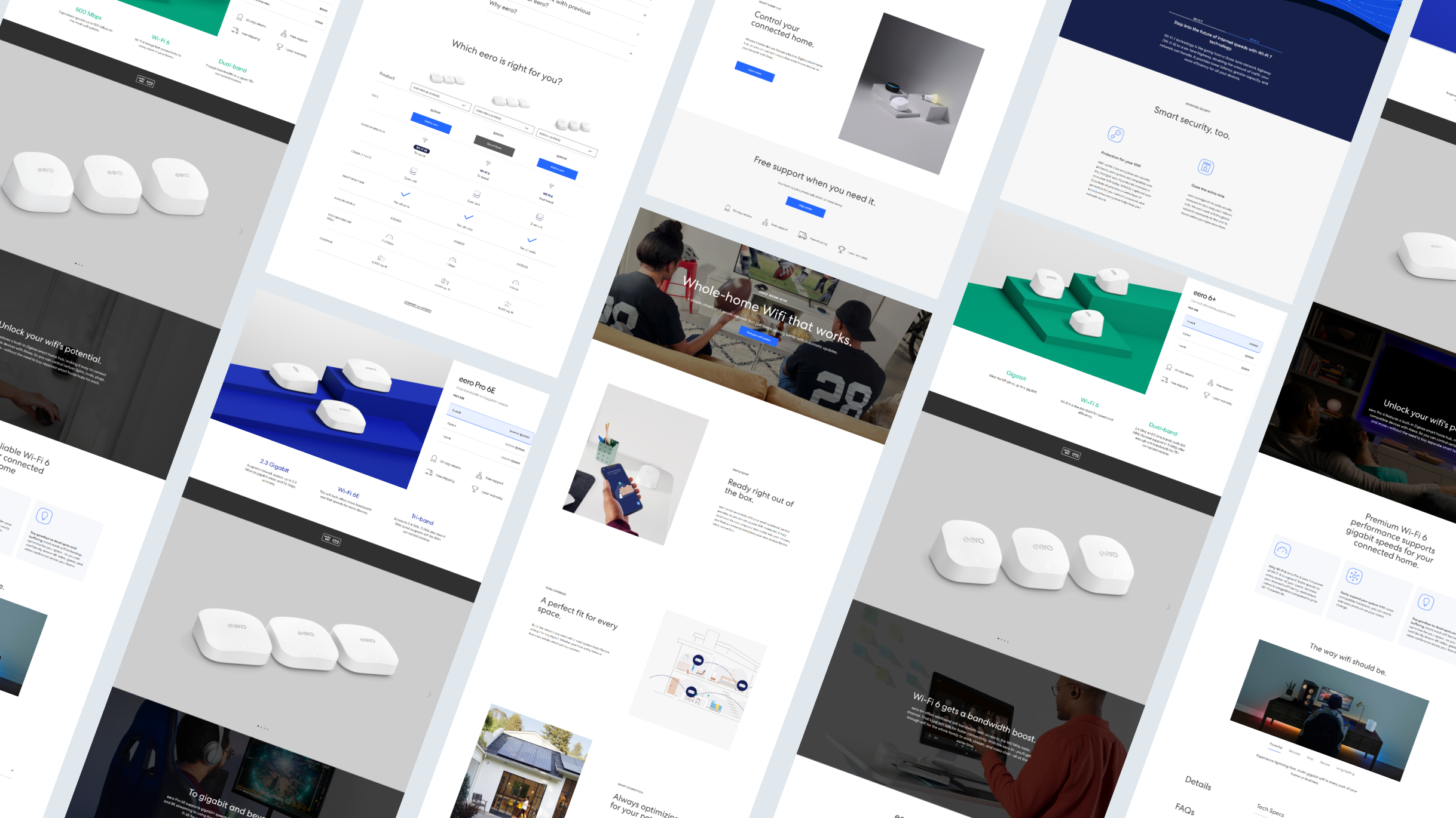
SUMMARY
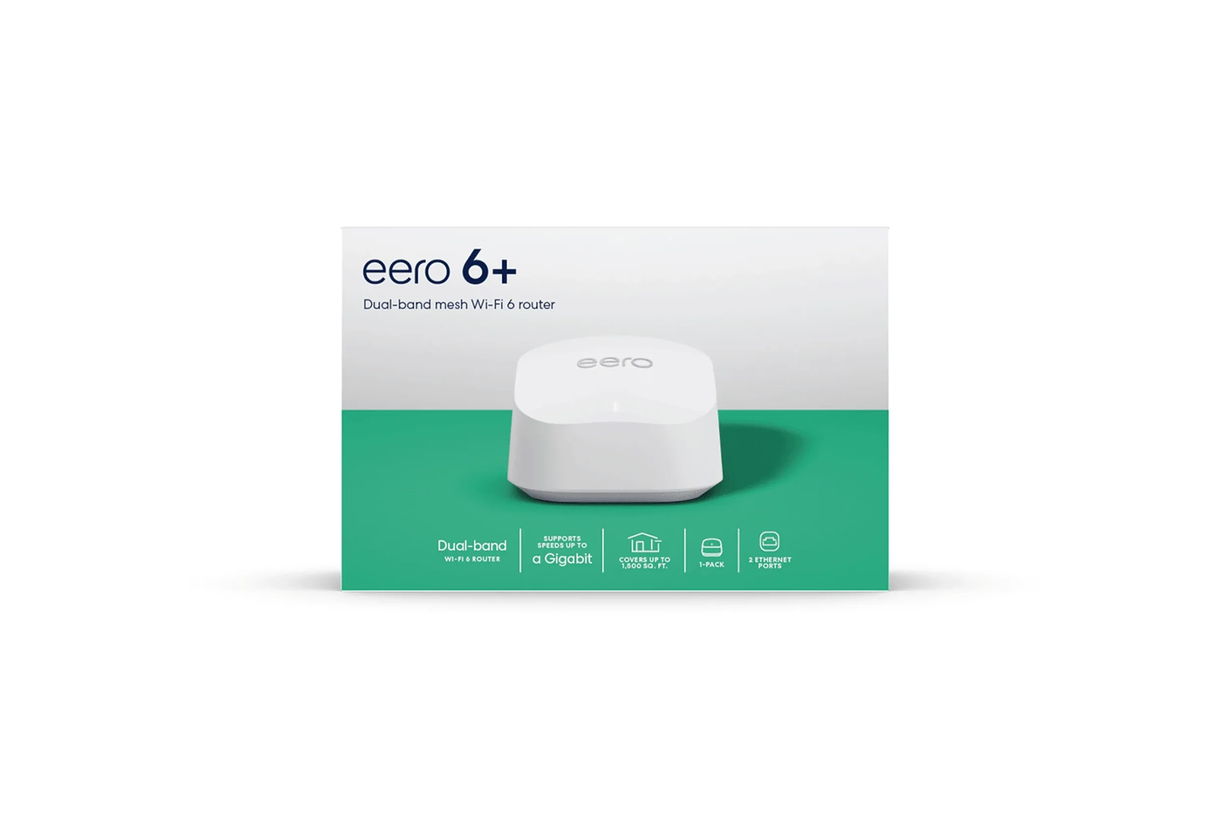
In 2022, eero Pro 6E and 6+ launched as eero’s first systems able to support gigabit speeds and 75+ devices on one network. The brand team brought two products to life by creating multiple touchpoints centering around faster speeds and more bandwidth for device coverage.
DATE
2022
ROLE
DESIGN LEAD
ART DIRECTION • DESIGN • ILLUSTRATION • MOTION
CONTRUBITION
Areas of focus
GOALS
Create knowledge around Wi-Fi 6E and how it creates more bandwidth within a network.
Market eero Pro 6E has the premium product with the latest Wi-Fi 6E technology and gigabit speed capabilities.
Market eero 6+ has the most affordable system with gigabit speed capabilities.
PROBLEM AREAS
Wi-Fi 6E technology wasn’t common knowledge.
Legacy systems carry the same color assignment as the newest products.
Positioning
“There’s an eero for that.”
Given the range of products that eero will be offering in 2022, we believe this concept allows us to talk about eero’ ability to serve a wide range of customers, home types, and use-cases with its portfolio. Some customer personas will include heavy gamer, tech guru, value shopper parent, and work-from-home professionals.
Wi-Fi 6E technology
Wi-Fi 6 technology is a step up from Wi-Fi standards of the past. The result is more efficiency, less congestion, and shorter wait times for data delivery than Wi-Fi 5.

Packaging color assignment
For pro tier products, royal blue is the primary color; in standard products, green is the primary color. The background color denotes which generation the product is from. eero Pro 6E and eero 6+ products use a light gray background. eero Pro 6 uses a dark shade of its accent color (royal blue); and eero 6, eero, and eero Beacon use a darker shade of their accent color (dark green).
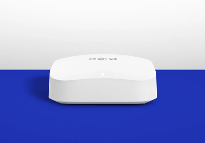
eero Pro 6E
eero Pro 6
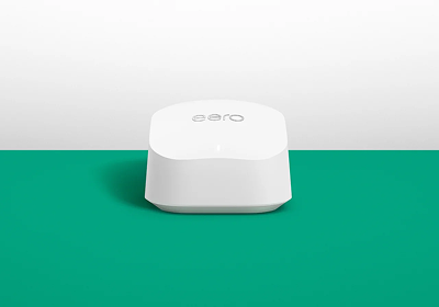
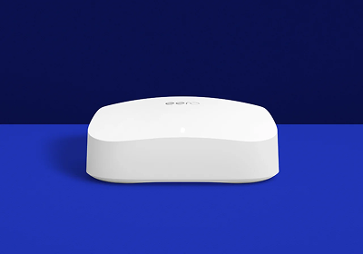
eero 6+
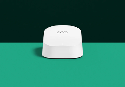
eero 6
Motion identity system
I led the strategy and concept of the motion identity system, in partnership with Character Studio, to create a cohesive, expressive motion language that elevates the brand across all digital touchpoints.
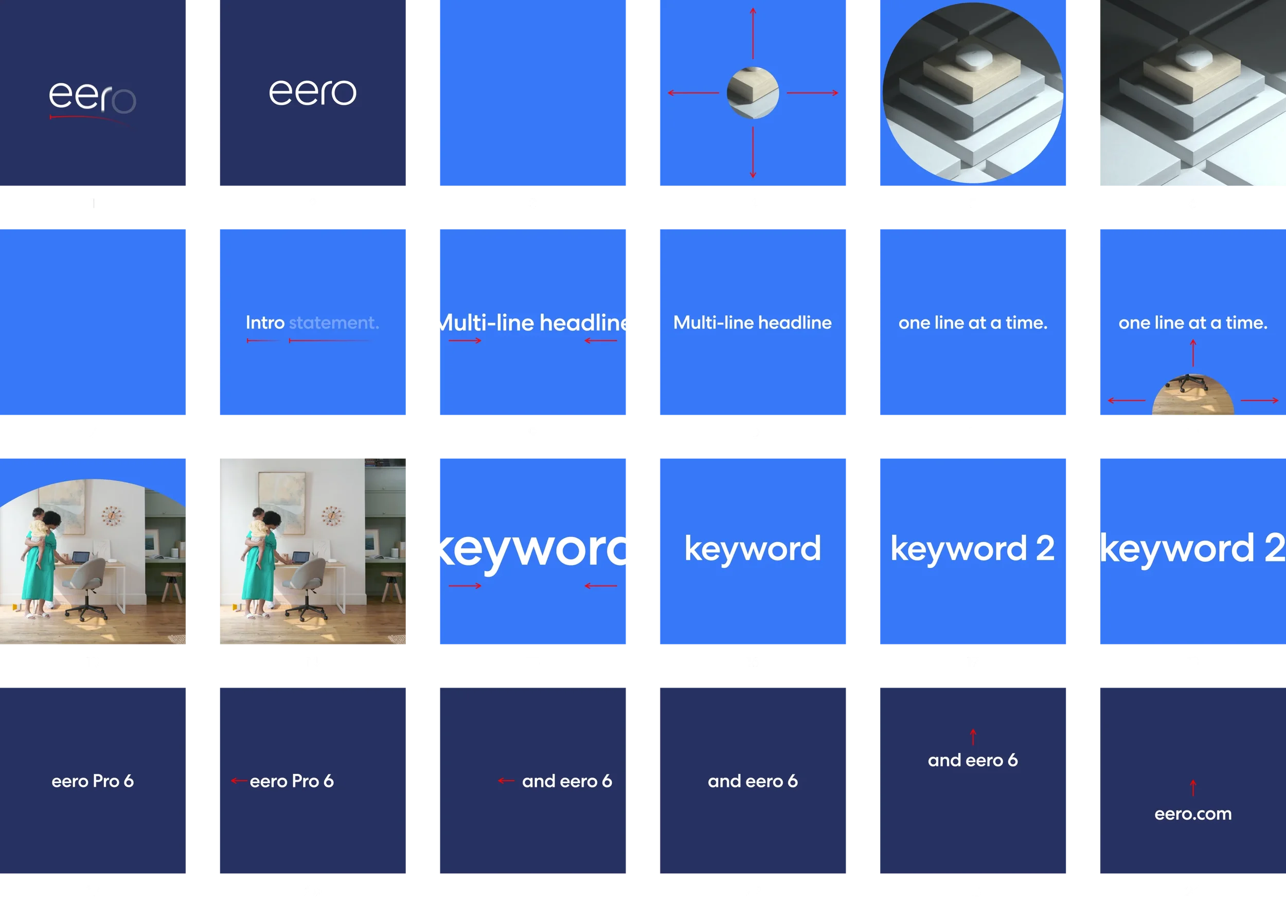
1–2. eero logo writes-on (character) with quick opacity and y-position shift
3. Periwinkle color flood
4–5. Circle mask starts from center and expands past frame
6. Image fills frame
7. Periwinkle color flood
8. Intro statement writes-on (word) with quick opacity and x-position shift
9–10. Multi-line headline appears scales out to fit in frame
11. Next line of text appears same way as previous line
12–13. Half-circle transitional mask appears from bottom and expands up past frame.
14. Image fills frame
15–16. Large keyword text appears using same motions as the multi-line headline
17–18. Additional keywords appear the same way
19–20. Product name appears centered in frame followed by x-positional shift towards left, then disappears
21–22. Second product name appears followed x-positional shift like previous
23. Second product name shifts up then disappears
24. URL appears followed by a y-positional shift up to center